
Intro
It is easy to say that Halo Combat Evolved was a defining game of my childhood. Even though it came out all the way back in November of 2001 it’s still played by hardcore fans all over the world in its original form.
Now with the release of Halo CE Anniversary Edition, the original game got a huge overall in its visual appeal. Back in 2001, it’s graphics were groundbreaking but of course, decades later those graphics were definitely showing its age especially when compared to modern AAA titles. With the anniversary edition, Halo CE has gotten some new life inspiring not only the hardcore or us but also new players to take the role of Master Cheif.
One of the amazing features that they included in the new game is the ability to switch between the new and old graphics. Short of actually playing the game trying to compare the remastered graphics with the classic is a bit tricky. Even while playing switching back and forth, while stunning, it is still a little hard to appreciate especially while you’re mowing down waves of enemies.
My goal is to slow things down and compare the graphics between the two generations in a series of screenshots. Each pair of images allows you to slides between remastered and classic graphics so you can appreciate all the little details.
Full Review
Table of Contents
Intro and Cutscenes
My goal with this series to provide an exact 1 to 1 pair of screenshots but right off the bat when I started comparing the classic intro cutscene and the remastered I noticed that there was no exact 1 to 1 match. The intro and in fact all the cut scenes, in the beginning, were redone. What the characters actually say hasn’t changed but their movements and gestures have changed along with the angles and perspectives of the camera. To make the remastered version feel more cinematic there’s a wider angle and narrower aspect ratio, so it’s impossible to take one screenshot from the remastered version that directly overlays one from the classic version. I did try some that I think really captures their differences.
The Pillar of Autumn
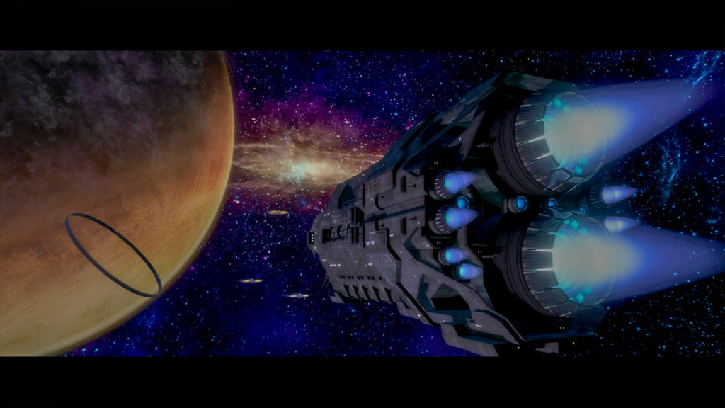
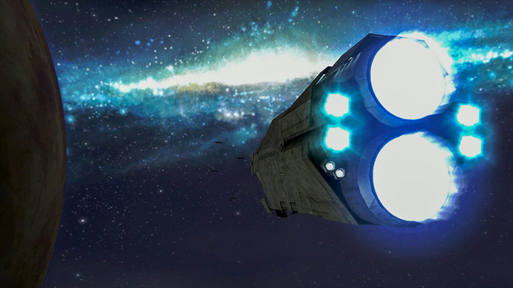
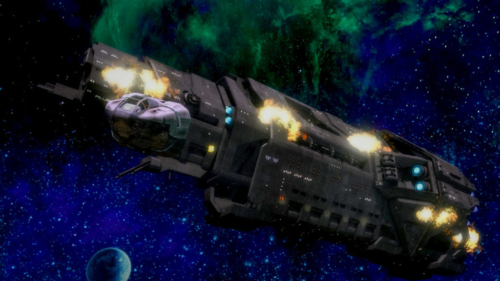
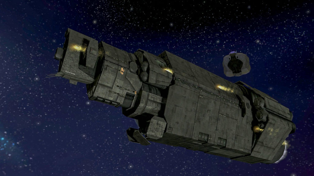
Beginning with the Pillar of Autumn in the intro, we start to see what will be a common theme throughout, massively updated textures, skyboxes, and the additional of crazy amounts of new details. We also see how the cut scenes have been altered. In the classic version, we didn’t see HALO in the same shot as the POA nor did we get a broadside shot of the POA, probably because there wasn’t a whole lot to show compared to the remastered version that way more details all along the ship.
The POA Hanger deck
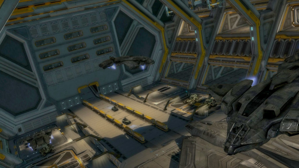
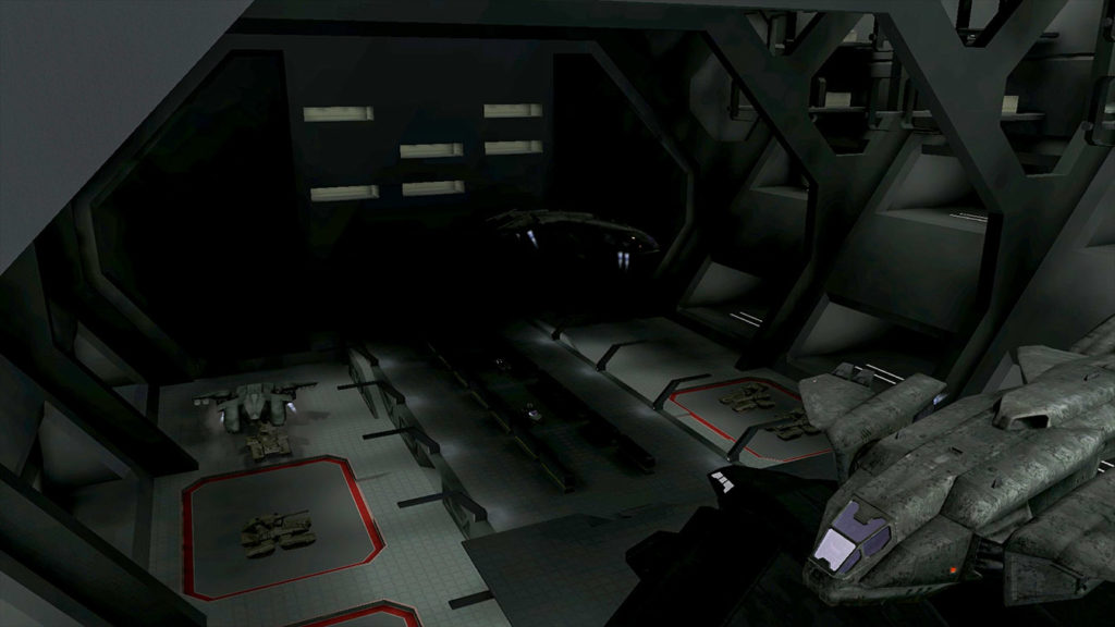
Next up inside one of the POA’s hanger decks we see just how much has changed not only with the textures and details but also lighting. The screenshots really speak for themselves. I honestly didn’t remember how dark the classic version was but we’ll see more of that as we continue. We also start to see how all the vehicles have been overhauled like the Pelican and to a less extent the Warthog and Scorpian tank.
Like I mentioned above due to camera work changes in the cutscenes the perspective is off but I think you can still appreciate just how much there is now.
Sergeant Johnson
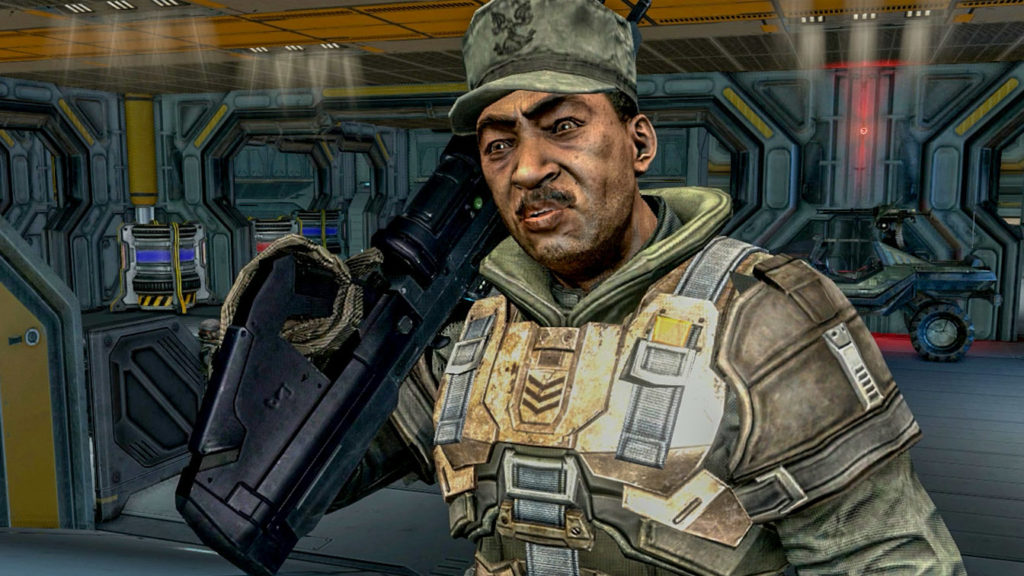
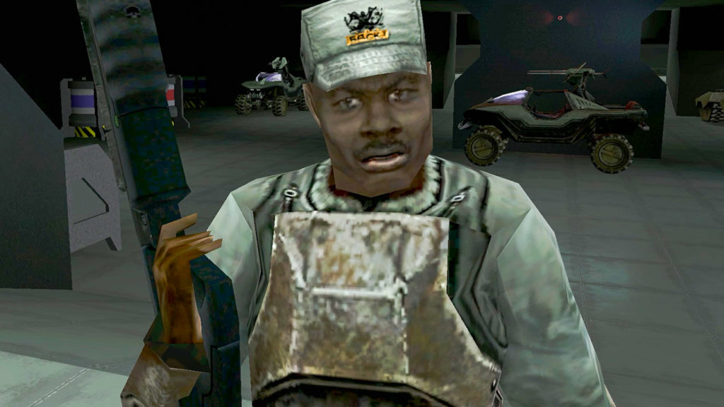
Next up we see just how much the characters have been overhauled and who better to start with than Sergeant Johnson delivering his most memorable lines during the intro? Obviously night and day, of course, that’s what a few decades of advancement will do for you. This is also where we start to notice that as much as all the detail is great It may start feeling too busy. But that may just be me being so used to playing the classic version.
Waking the Cheif
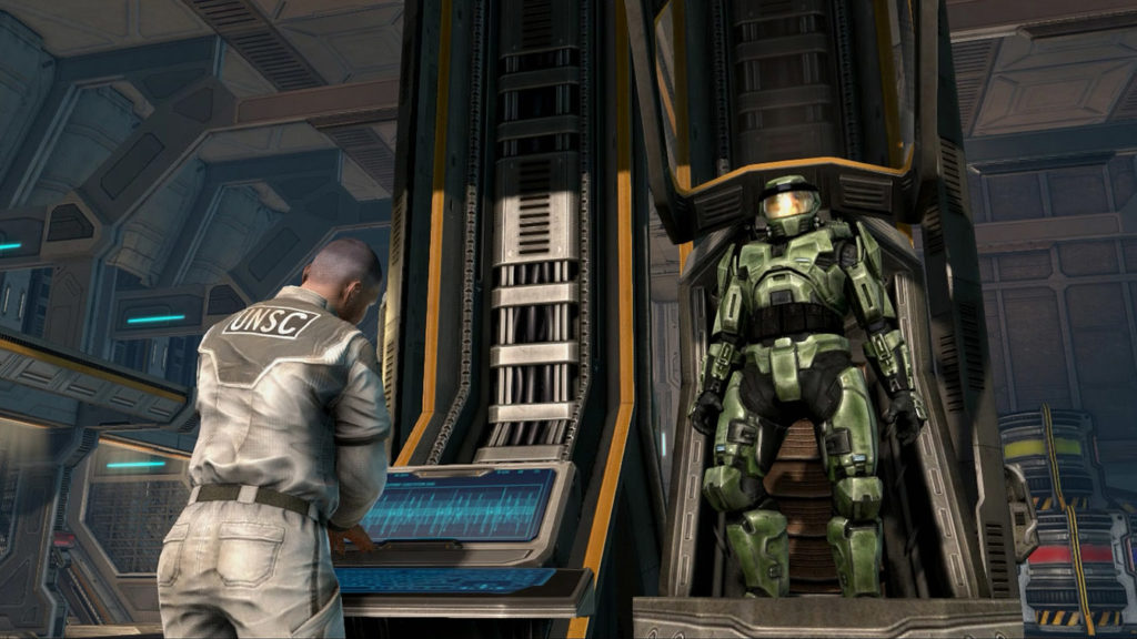
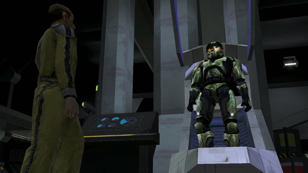
We get a glimpse of two more character updates, of course, the most important being our beloved Master Cheif John 117. The perspective is off but you can still make out the updates to the chief’s armor. The biggest update is actually to the technician at the control console. He isn’t even the same person anymore!
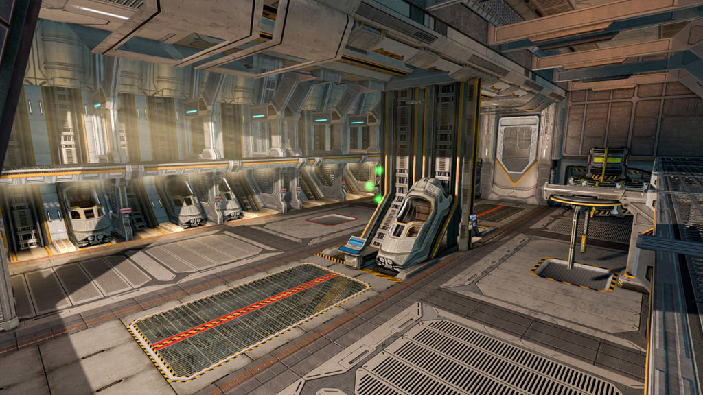
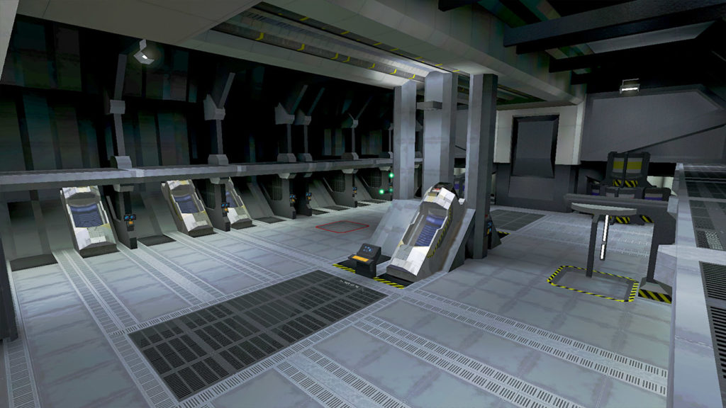
Cryo-room
After the cutscenes, we finally are able to get a 1 to 1 comparison with the exact same view. There is no doubt how much work they put into updating the game when looking at this comparison of the cryo room after first waking up and a great example of how the updated textures and lighting really work together to make this once simple room way more interesting.
Hallway One
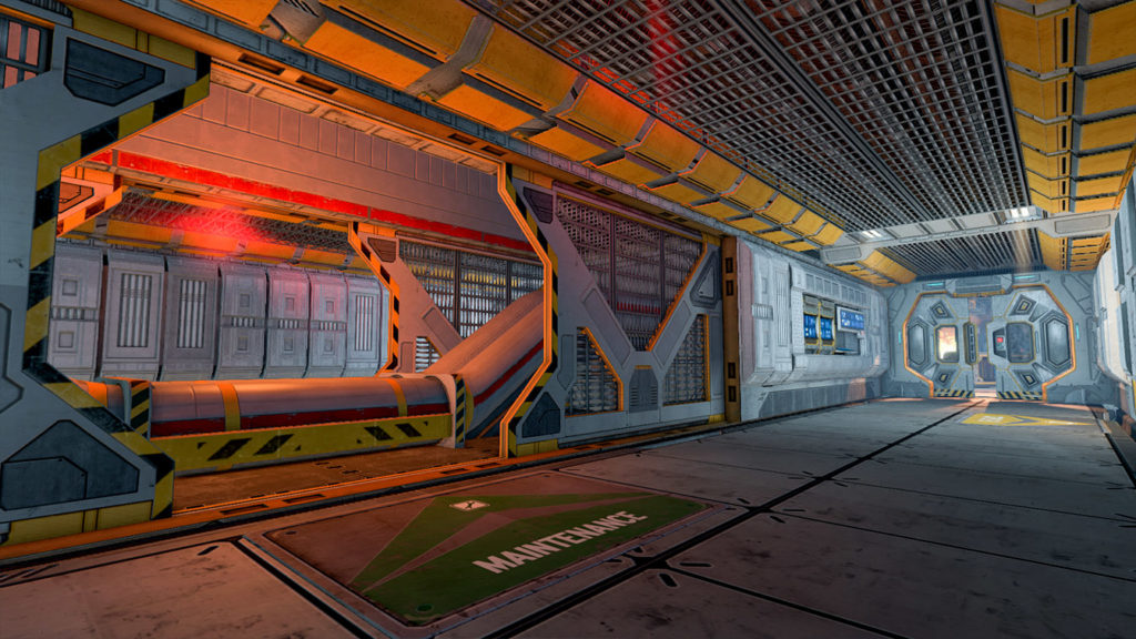
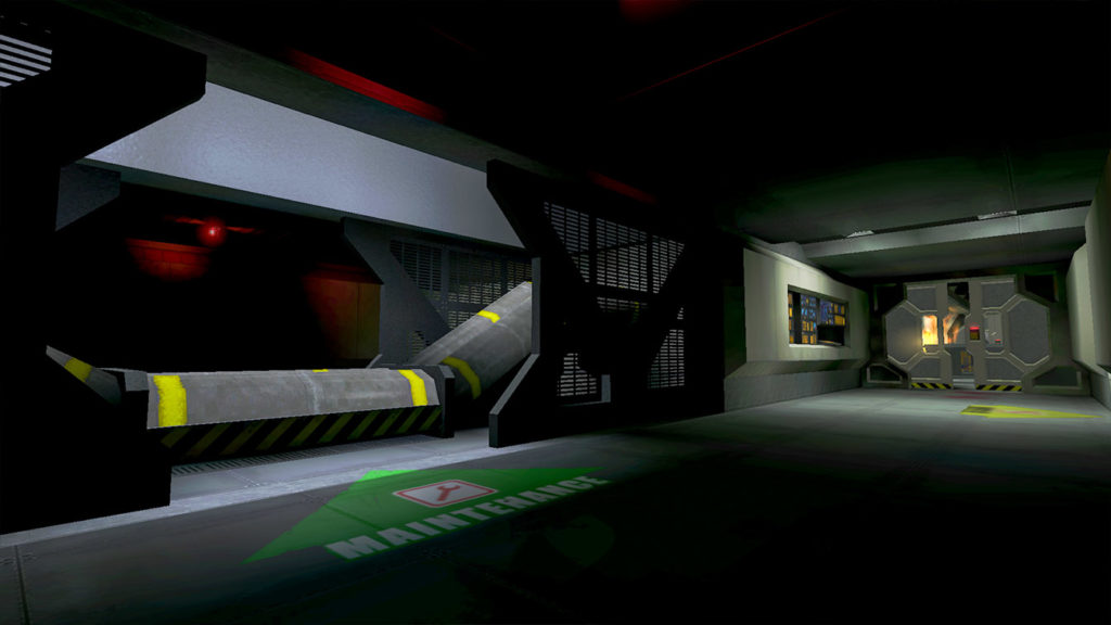
Right outside the cryo-room we are treated to more massive texture updates but also to a great example of the new dynamic lighting as the fire casts lighting and creates shadows on our side of the door which flickers with the fire,
Armory
Another example of lighting and texture updates in a POA armory,
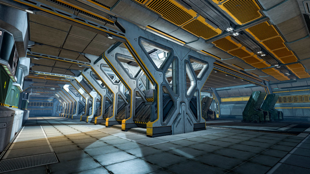
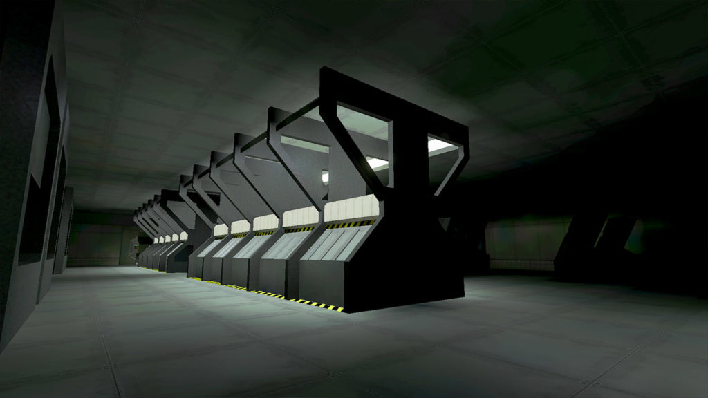
The Message Board
The message board outside the bridge has radically been updated for the better. Not to mention the Marine’s models. They seem to have gotten fatter but I’ll just assume it’s the updated armor. We also get a glimpse at the updated weapon texture for the assault rifle.
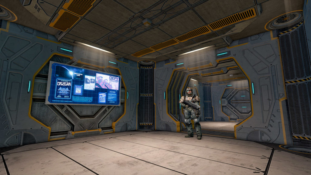
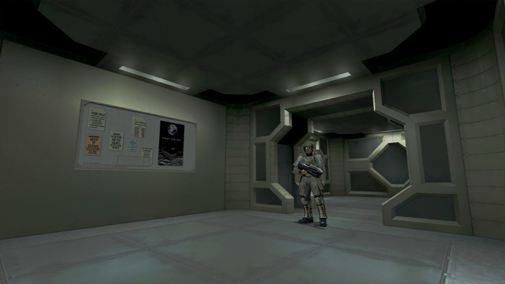
Captain Keyes
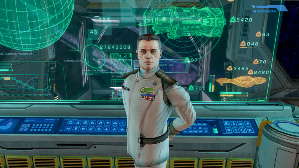
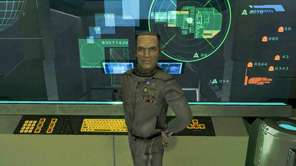
Captain Keyes’ update was quite a shock for me at first. I’m still not entirely used to the new model, maybe because he seems a little shorter. Non-the less his update is a drastic one. Not to mention all the display and console updates all over the ship.
Cortana
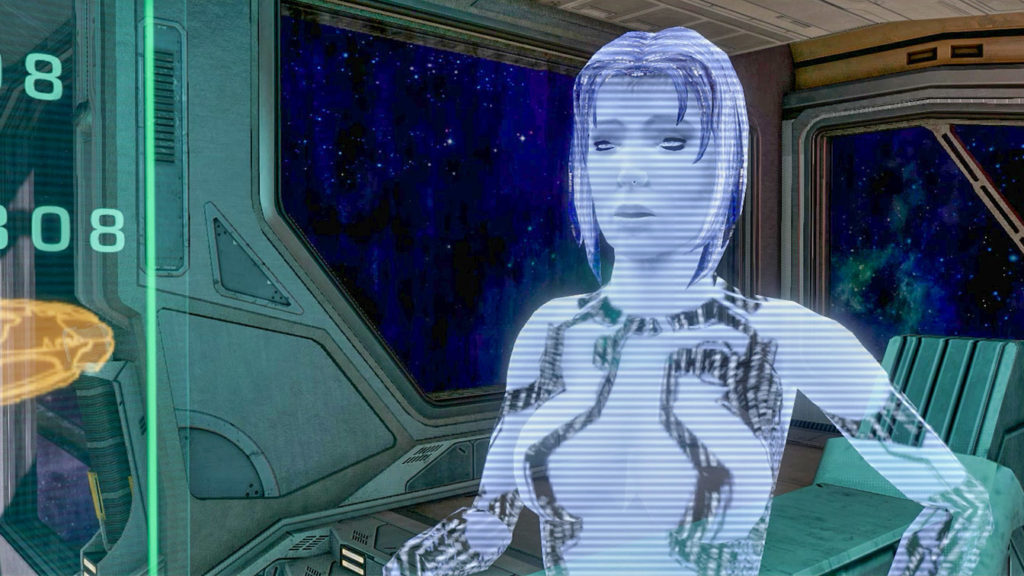
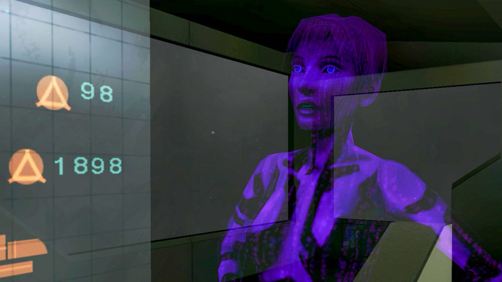
Into another cutscene, we find another shocking character update for me. Cortana’s model has been completely updated. One positive is you can actually see her. Something I again didn’t notice was an issue before but I think that’s because there wasn’t much in the background to get in the way.
The Bridge
Everything about the bridge has been overhauled from all the control panels and readouts to all the crew models, there is a lot more going on and visible!
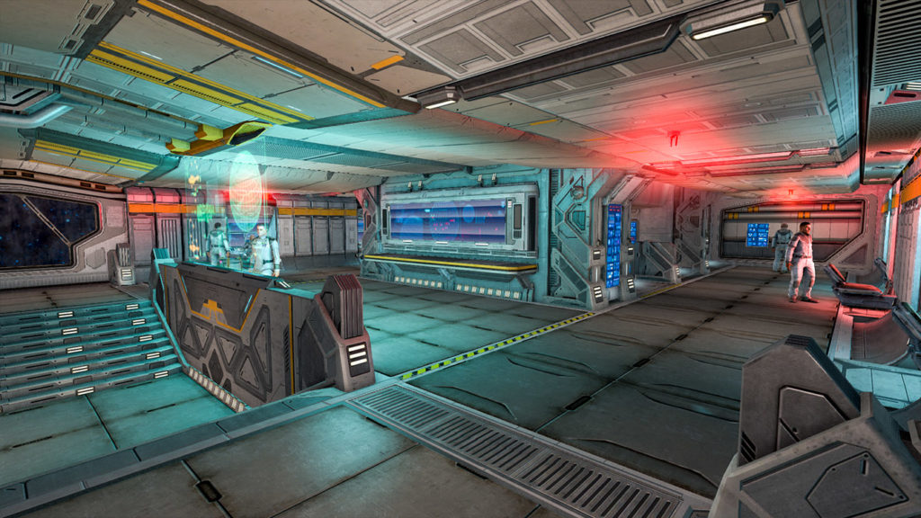
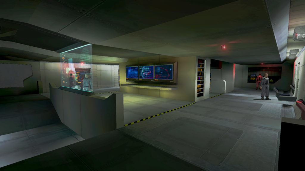
The View
The view outside the bridge is now something to behold. The updated skybox alone will you gazing at it for longer than you expect and the update HALO is amazing.
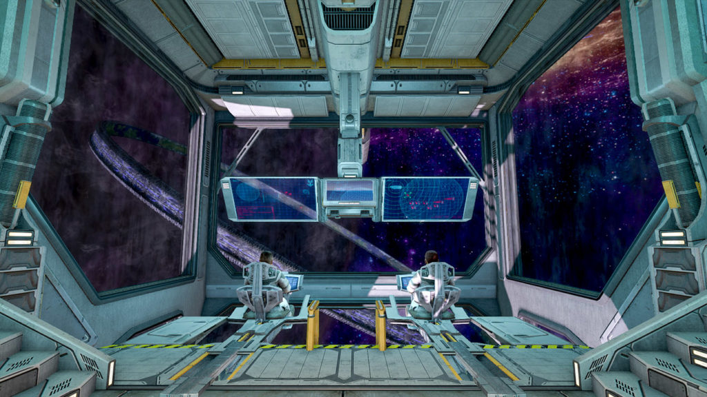
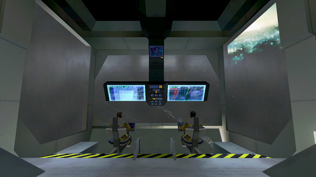
Mess Hall
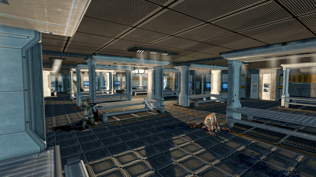
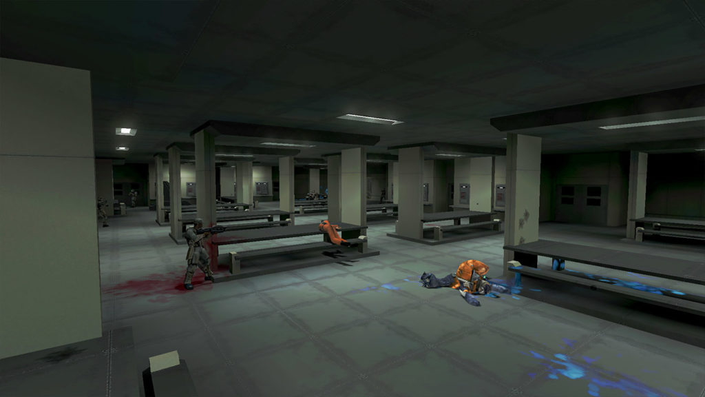
More of all the good stuff. We can start to see the updates to weapons from our perspective.
Airlock One
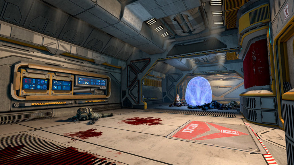
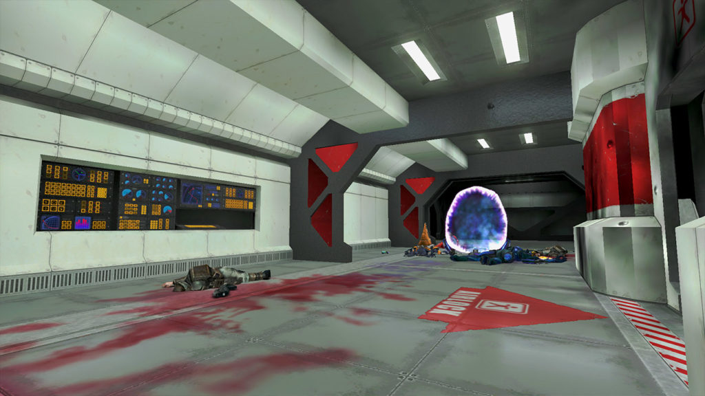
Another common theme is the massively improved control panels everyone, they are actually readable now. I also really like how they updated the Covenant stationary shield they look like they are emitting the shield from the central point, it just looks great.
Hallway Two
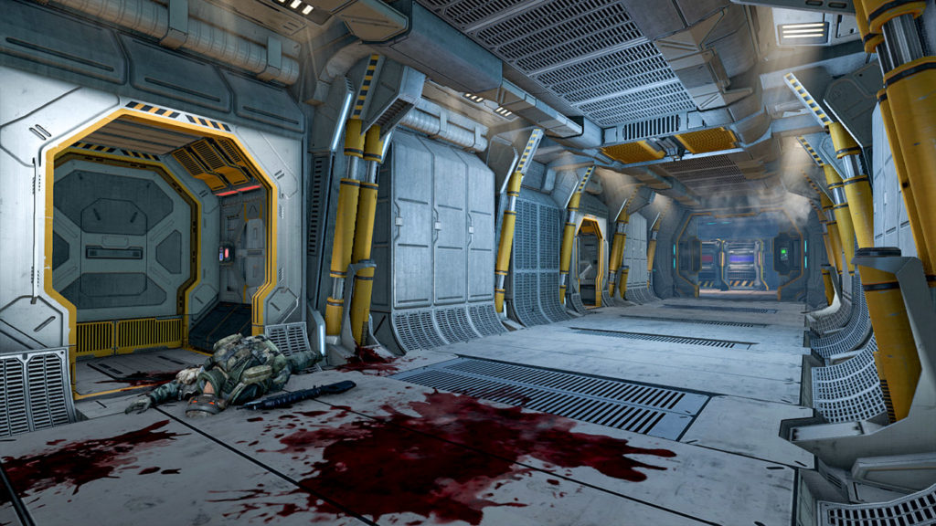
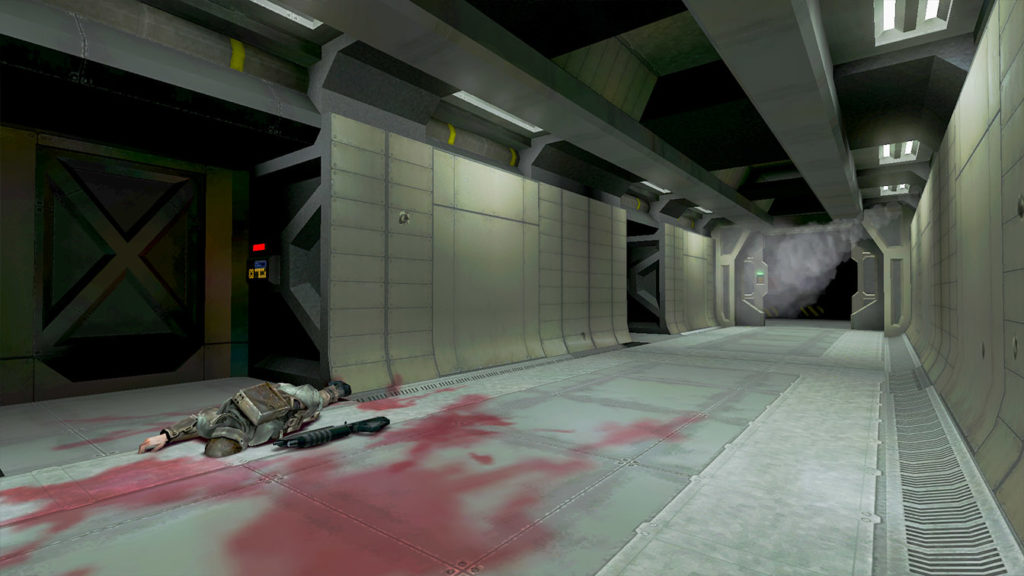
The hallways, in general, have a lot more going on that makes the whole ship feel more alive even if it is riddled with dead bodies. Speaking of which the blood slattered has also received an overhaul.
Hallway Three
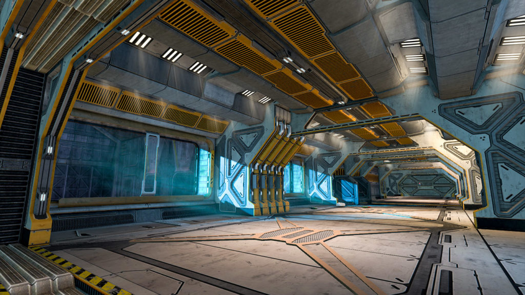
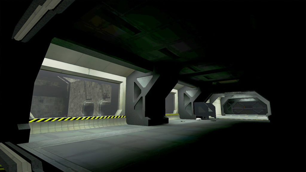
The lighting effects are amazing in this hallway.
Destruction Hall
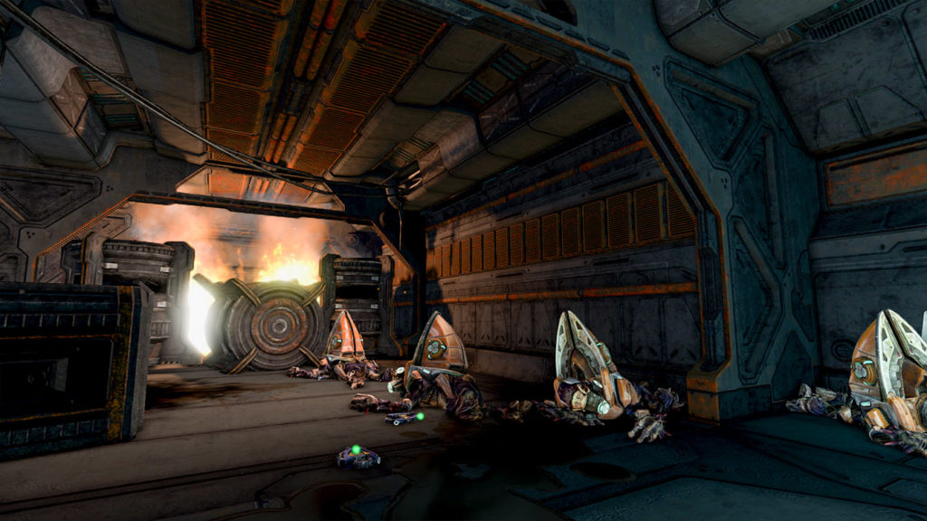
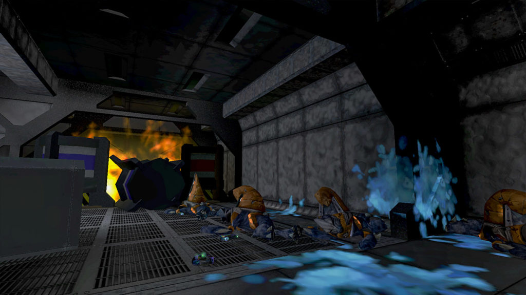
This is a great example of the updated fire animation with the volumetric smoke and light bounces off the wall. We also get a look at the new character models for the Grunts.
Pillar of Autumn End
In the last cutscene of the level, we get a great look at the Pillar of Autumn from the outside. I’ll let the images screen for them selves!
Part 1 End
I really hope you enjoyed this collection. My aim to go through all the levels and get the best shots that compare both generations of graphics to their fullest.


